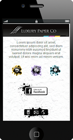
 Here at piJnz we are super-excited about the new powerful feature that should change the mobile CMS world as we know it. In last week's release we've introduced "hot spots", which is the ability to add interactive action spots to any graphic you upload to your mobile website.

Why is this important?
Up until recently, when it comes to building mobile landing pages and websites, agencies and marketing professionals had two choices:
- Build cookie-cutter mobile content based on a mobile CMS platform. Yeah, you can change a few parameters such as your background colors and fonts, upload a different graphic, change widgets around and change icons. But - you can't change the structure (or the template) of the mobile page. After a while all the mobile pages you've created "feel" the same.
- If your client's brand matters, you really need to start from scratch: get your designer to build the mobile site the way you and your client want it. Then hire a programmer to convert the creative design file into HTML and CSS. Then test it across multiple devices (or at least - popular smart phones). Painful, expensive and time-consuming.
With piJnz's unique and patent-pending feature now we can build any look we want, and without programmers! Now you can custom-design the mobile page in Photoshop or your favorite design program, slice it into a few graphics, upload the graphics and assign your interactive spots (links, tap-to-call actions, sharing, etc.) to the graphics. 5 minutes and bingo! - you have the exact look you want, with zero programming and zero pain. The images perfectly stretch and fit on any device screen size, and look great even on desktops.
Watch this short 4 minute video to see how this works:
First, it gives you the full control over the look of the mobile pages without having to get the programmer involved. You need to work with a designer (or be a designer), of course. But with piJnz you can completely bypass the traditional approach of spending weeks of programmer's time on coding the HTML and CSS, and then another few weeks on tracking and fixing mobile device compatibility bugs.
With piJnz you simply upload your creative design graphics, add hot spots to it, and click on "Publish". The resulting mobile page looks exact the way you want, works seamlessly across thousands of mobile devices, and looks great even on desktops and tablets.
And second, now there is no reason to settle for the mediocre cookie-cutter mobile websites. Away with cookie-cutter! With a bit of design time and creativity you can build really amazing and truly one-of-a-kind mobile landing pages and websites.
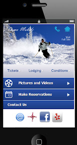
Also, take a look at this 2nd short video we posted on how to build a mobile ski lodge demo website (you see the screen shot of it above).